Advanced digital coloring techniques: shading, blending, and depth that transform your pages
Advanced digital coloring techniques are what turn a flat, basic coloring page into something with volume, light, and mood. If you already know how to fill regions and pick palettes, the next step is learning how shading, blending, and depth work — and how to control them on a screen. None of this requires talent. It requires understanding a few principles and applying them consistently.
This guide covers the techniques that have the biggest visible impact: color relationships that create depth, shading that gives shapes form, blending that makes transitions invisible, and approaches like grayscale and mixed media for when you want to stretch further. It builds on our complete guide to digital coloring and assumes you already choose palettes confidently.
Why advanced techniques change your results
The difference between a good page and a great one is rarely more colors — it is more deliberate color. Advanced techniques give you three things:
- Control over light. You decide where shadows fall and where highlights live, instead of leaving them to chance.
- Control over mood. Warm foregrounds, cool backgrounds, and tonal contrast change how a scene feels.
- Consistency. When every shadow follows the same light source, the whole page looks intentional.
The same principles apply whether you are working on a cozy interior, a nature scene, or a pop star page with dramatic lighting.
Color shortcuts that create instant depth
Before touching a brush, you can create depth with color alone. Two relationships do most of the work:
Warm vs cool temperature
Warm colors (reds, oranges, yellows) appear closer. Cool colors (blues, greens, purples) appear farther away. Color a foreground subject in warm, saturated tones and the background in cooler, muted tones, and the page separates into layers without a single shadow.
Complementary accents
Complementary pairs — blue and orange, purple and yellow — sit opposite each other on the color wheel. Used as small accents, they pull the eye to a focal point. A muted page with one orange lamp instantly gains a center of interest.
If you want to review the palette side of this, our guide to choosing color palettes for digital coloring explains temperature and contrast in depth.
Shading techniques that give shapes form
Shading is how a flat region becomes a three-dimensional object. These are the four techniques that matter most.
Gradient shading
A gradient moves smoothly from a light tone to a darker version of the same color, simulating how light wraps around a curved surface. Start with the base color, add a darker tone along one edge, and blend the boundary. Most tools let you do this with a soft brush at low opacity or a dedicated gradient fill.
Layered shading
Build depth in three passes: base color, then a mid-tone over part of the region, then a shadow tone where light would not reach. This three-layer approach works for almost any shape — a sphere, a mug, a cheek.
Cross-hatching
Overlapping sets of parallel lines create texture and shadow at the same time. It works well for foliage, fabric, and backgrounds that want a hand-drawn feel. If your tool has a fine brush with low opacity, this is easy to replicate digitally.
Consistent shadow placement
This is the rule that ties everything together: pick one light source per page and keep every shadow consistent with it. If light comes from the upper left, shadows fall to the lower right. Inconsistent shadows destroy depth faster than any other mistake.
Blending techniques for invisible transitions

Blending is what makes shading look natural. A hard edge between two colors reads as a mistake; a soft transition reads as light.
| Technique | How it works | Best for | |---|---|---| | Opacity layering | Paint at 10-30% opacity and build up passes | Precise, controlled transitions | | Blend or smudge tool | Pulls color across the boundary | Fast, smooth gradients | | Multiply layer | Darkens what is beneath, preserving hue | Natural shadows | | Screen layer | Lightens what is beneath, preserving hue | Highlights and glows | | Overlay layer | Darkens darks and lightens lights | Richness and contrast |
The opacity rule
Working at low opacity and layering passes is the most forgiving blending method. Each stroke adds a thin layer, so you control exactly where the transition happens. Over-blending at full strength is the most common cause of muddy pages.
Layer modes as shortcuts
If your tool supports layers, Multiply and Screen are transformative. Paint a cool tone on a Multiply layer to add shadows without recoloring anything. Paint a warm tone on a Screen layer to add light. You can adjust or delete these layers later without touching your base work.
Creating depth in a scene
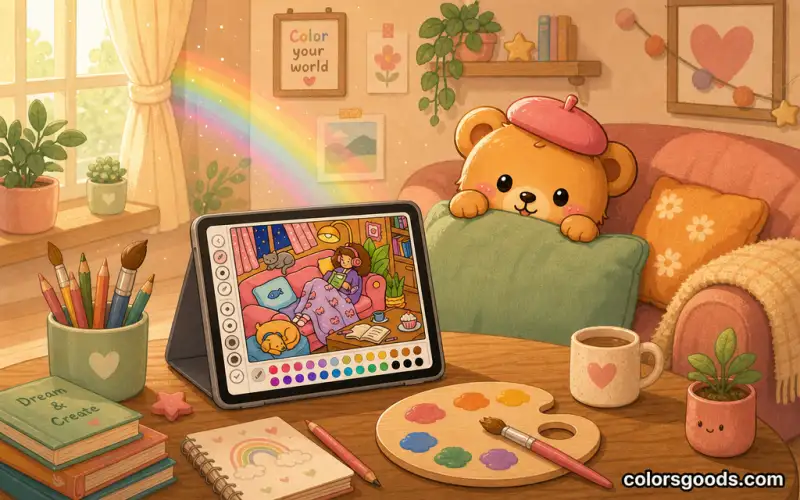
Depth is the illusion that some parts of the page are closer than others. Beyond color temperature, three techniques build it convincingly:
- Contrast hierarchy. Foreground elements get strong contrast; background elements get muted contrast. This mirrors how the eye perceives distance.
- Atmospheric perspective. Make distant elements lighter, less saturated, and slightly cooler — as if seen through air. A subtle shift is enough.
- Ground shadows. A thin shadow where an object meets the surface anchors it. Without one, objects look like they are floating.
When you combine warm foregrounds, cool backgrounds, and consistent shadows, even a simple scene reads as dimensional.
Grayscale pages: the advanced practice that teaches value
Grayscale coloring pages come pre-shaded in tones of gray. You color over the values, and the shading shows through — producing painterly results while teaching you exactly how light and shadow behave. It is an excellent bridge between coloring and painting, and it forces you to think in value (lightness) rather than just hue.
Start with a limited palette of three to five colors so the grayscale does the tonal work. Layer gently, work from dark areas to light, and resist covering every gray area completely.
Mixed media: combining paper and screen
Advanced colorists often mix traditional and digital in the same piece. Two workflows are worth trying:
- Start on paper, finish digitally. Color with pencils or markers, scan the page, then add glows, highlights, and corrections in a digital tool.
- Start digitally, finish on paper. Print your line art or a planned palette, color by hand, and scan the result to polish it.
Even fully digital work benefits from importing paper textures or using brushes that simulate traditional media. The texture adds warmth that flat digital fills lack.
Tools that make advanced techniques possible
Not every tool supports the same features. Before choosing, check for these:
| Feature | Why it matters | |---|---| | Layers | Separate base, shadows, highlights, and effects | | Opacity control | Precise, buildable transitions | | Blend/smudge tool | Fast, smooth gradients | | Layer modes | Multiply and Screen for light and shadow | | Custom palettes | Apply color theory precisely |
If your tool is missing some of these, focus on what it does support. Opacity layering and consistent shadow placement alone can transform your pages — you do not need a professional app to start.
A practice plan that works
Improvement comes from deliberate practice, not marathon sessions. Try this:
- Shade one sphere per day with a different light source each time. This builds shadow intuition fast.
- Blend one small area per session using low opacity instead of high opacity.
- Pick one page per week to apply all three depth techniques together: temperature, contrast hierarchy, and ground shadows.
- Compare before and after. Save your first attempt and redo the same page two weeks later.
For the fundamentals behind all of this, our coloring techniques for beginners guide is a useful refresher.
FAQ
How long does it take to see improvement?
Most people notice a clear difference within two to three weeks of consistent practice. Fifteen minutes a day beats a long session once a month.
Do I need an expensive tablet or stylus?
No. Advanced results come from understanding light, color, and composition — not hardware. A phone supports opacity, blending, and simple layers. A larger screen and stylus make the work more comfortable, not more correct.
What is the difference between blending and layer modes?
Blending mixes two adjacent colors at their boundary. Layer modes change how an entire layer interacts with the layers below it — darkening, lightening, or boosting contrast. They work together in most advanced workflows.
Can I use these techniques in a browser tool?
Partially. Opacity layering, palette control, and consistent shading work in almost any tool. Layered workflows and blend modes need apps that support layers. Start with what your tool offers and build from there.
What should I practice first?
Shading. Master gradient and layered shading on simple shapes before touching layer modes. Everything else builds on your ability to control light.
Conclusion
Advanced digital coloring techniques are not about hidden talent — they are about a few principles applied consistently. Learn how light behaves, keep your shadows consistent, blend at low opacity, and use temperature to separate foreground from background. Then practice one technique at a time.
Ready to put these into practice? Start with a simple page and apply one new technique per session. For palette help along the way, revisit choosing color palettes for digital coloring, or learn to create custom pages to practice on with our guide to making your own coloring pages.
Learn more about the project →
Colors Goods is researched, written, and reviewed by our small editorial team so every post stays clear, practical, and family-friendly.
Reviewed by Daniel Costa
Editorial contributor — app features and digital tools