
How to choose color palettes for digital coloring: a practical guide
Color palettes for digital coloring are the difference between a page that looks random and one that looks designed. A palette is a small, intentional set of colors chosen to work together. When you use one, you stop second-guessing every tap and start coloring with confidence — and even a simple page comes out looking polished.
This guide gives you the whole toolkit: why palettes matter, the five palette types that cover almost every situation, exact palette recipes by mood, and the mistakes that ruin pages. It builds on the foundations in our complete guide to digital coloring for adults, so you can jump straight into choosing colors.
Why a palette beats picking colors one by one
Colors never work alone. A shade only looks good or bad in relation to the colors around it. That is why a palette — a group of colors chosen to cooperate — matters more than any individual color.
A good palette does four things:
- Creates mood. Warm colors feel cozy. Cool colors feel calm. Pastels feel dreamy.
- Builds consistency. When every color belongs to the same family, the whole page reads as one piece instead of a patchwork.
- Reduces decision fatigue. You stop dithering over every fill and relax into the page.
- Prevents visual chaos. Random colors fight each other. A palette keeps them working together.
Think of it like a recipe: a single ingredient is fine, but the combination is what makes the meal.
The five palette types every colorist should know

These five types cover nearly every coloring situation. Learn what each one feels like, and you will know instantly which one your page needs.
| Palette type | Colors | Feeling | Best for | |---|---|---|---| | Warm | Yellows, oranges, reds, warm browns | Energy, comfort, inviting | Food, sunsets, cozy interiors | | Cool | Blues, greens, purples | Calm, serene, refreshing | Nature, night skies, water | | Pastel | Soft, desaturated tones | Gentle, dreamy, innocent | Kawaii, bedtime, floral scenes | | Monochromatic | One hue in many shades | Elegant, unified, sophisticated | Minimalist, focused subjects | | Complementary | Opposite colors on the wheel | Vibrant, dramatic, bold | Focal points and accents |
Warm palettes
Warm palettes feel like a sunny afternoon. They work beautifully for cakes and coffee scenes, autumn landscapes, and rooms lit by candlelight. You do not need everything to be red or orange — a cream base with a terracotta accent keeps the warmth without shouting.
Cool palettes
Cool palettes feel like a deep breath. They suit forests, oceans, moonlit rooms, and rain. Keep a little brightness in your accents so the palette stays refreshing instead of melancholy.
Pastel palettes
Pastels are the most forgiving choice. Dusty pink instead of hot pink, mint instead of emerald, lavender instead of violet. Because the colors are soft, they blend together even when your placement is not perfect — a great starting point if you are new to color selection.
Monochromatic palettes
Pick one color and use it across every value, from near-white to deep. Light blue, medium blue, navy, and a pale blue-gray. The result looks elegant and lets the illustration itself carry the page.
Complementary palettes
Complementary pairs sit opposite each other on the wheel: blue and orange, purple and yellow, red and green. They create real energy, but they need a boss. Use one color as the dominant tone and the other as a small accent — a 50/50 split usually feels loud.
How to build a palette from scratch in five steps
You do not need to be a color theory expert to build a good palette. Follow this process:
- Pick a mood first. Cozy? Calm? Playful? Dramatic? The mood guides every color that follows.
- Choose one or two base colors. These cover the largest areas — the background, the sky, the biggest shapes.
- Add one or two accent colors. Accents live in small details: a flower, a scarf, a lamp, a star. They should stand out but still belong.
- Limit yourself to five colors. Fewer than three feels flat. More than seven feels chaotic. Five is the sweet spot.
- Test on the actual page. Fill a few regions and look at the whole composition before committing. Colors that work in a swatch can behave differently on screen.
Palette recipes for every mood

Sometimes you just want a palette that works. These recipes give you a complete starting point for common moods.
| Mood | Base colors | Accents | Best for | |---|---|---|---| | Cozy afternoon | Warm brown, cream | Soft gold, dusty rose | Reading nooks, kitchens | | Rainy day | Slate blue, warm gray | Pale gold, soft plum | Window scenes, bedtime | | Soft dreamy | Baby pink, lavender | Mint, powder blue | Bedrooms, florals, kawaii | | Night drama | Deep navy, charcoal | Emerald, gold | Night scenes, moody pages | | Bright energy | Electric blue, yellow | Neon pink, white | Concert and party scenes |
These combinations reuse the same handful of colors across the page, which is what makes the palette hold together. For more inspiration tied to specific page styles, explore our cozy coloring pages guide.
Common palette mistakes (and how to avoid them)
Even experienced colorists fall into these traps. Knowing them makes you faster at avoiding them.
- Using too many colors. Eight or ten colors almost always look busy. Five or fewer look intentional.
- Ignoring the mood. Pretty colors that fight the scene create a mismatch between what you see and what you feel.
- Mixing warm and cool without a plan. Warm and cool can coexist, but one family must lead. Use the other sparingly.
- Going too saturated everywhere. Bright colors are exhausting across a full page. Desaturate the base tones and save the intensity for accents.
- Skipping the test step. Try the palette on part of the illustration before coloring everything. It is the fastest way to catch problems.
Mobile-first: making palettes work on a small screen
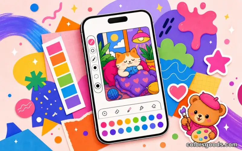
If you color on a phone, a limited palette is even more valuable. Small screens punish clutter — too many similar tones blend together and details get lost.
A few habits help:
- Pick the palette before you start coloring. Deciding first saves time and taps.
- Save a favorite palette and reuse it. Repeating colors across pages makes your style feel consistent.
- Start with the biggest area. Seeing the main shape filled tells you fast whether the palette is working.
For the full workflow of coloring on a phone, including tool tips, read our guide to coloring online on your phone.
FAQ
How many colors should I use per page?
Five is the ideal number for most illustrations. Go as low as three for minimalist pages, or up to seven for complex scenes with several focal points. Beyond that, pages usually start to feel cluttered.
What palette is best for beginners?
Pastel palettes. Because the colors are soft and low-contrast, they blend together naturally even when placement is imperfect. Warm pastels suit cozy scenes; cool pastels suit nature and bedtime themes.
Can I mix warm and cool colors?
Yes, but with a clear hierarchy. Use one color family as the base and the other as a small accent. A warm orange base with a cool blue accent creates vibrant contrast. A 50/50 split feels disjointed.
How do I make a page look less chaotic?
Reduce the color count, increase the contrast between base and background, and keep accents small. The fastest fix is usually removing one or two colors.
Where can I find palette inspiration?
Nature photos, seasonal themes, mood boards, and illustrations you admire all contain ready-made palettes. Notice the colors that appear together in a sunset or a café interior — then transfer those relationships to your page.
Conclusion
Choosing color palettes for digital coloring is one of the most impactful skills you can develop. A good palette turns a flat page into something cohesive, mood-driven, and satisfying to finish. Start with a mood, pick five colors, test them on the page, and adjust from there.
Want to go further? Practice these palettes with our coloring techniques for beginners, or push your pages to the next level with advanced digital coloring techniques.
Learn more about the project →
Colors Goods is researched, written, and reviewed by our small editorial team so every post stays clear, practical, and family-friendly.
Reviewed by Daniel Costa
Editorial contributor — app features and digital tools