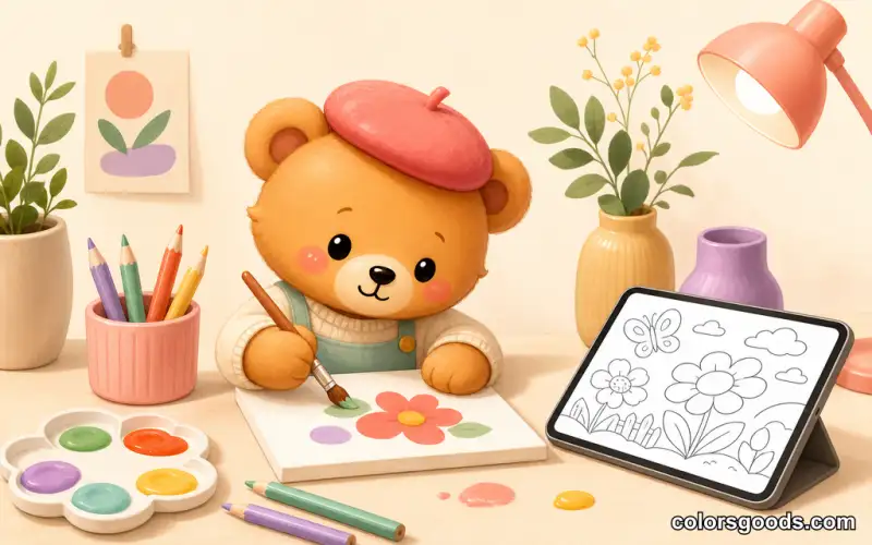
How to Color Bobbie Goods Pages: Techniques That Look Polished
Bobbie Goods pages are among the most popular coloring subjects online, and for good reason. The clean line art, the adorable characters, and the cozy scenes invite colorists of every level. But there is a real difference between filling areas with flat color and finishing a page that feels intentional. The good news: with the right order of work, a small palette, and a few simple techniques, anyone can get a result to be proud of — on a phone, a tablet, or paper.
This guide is a practical tutorial: fundamentals first, then blending and shading, then advanced touches like fabric folds and food gloss.
Why Bobbie Goods Is the Perfect Style to Practice On
Three qualities make these pages an ideal training ground. First, the simple lines are forgiving: clean, bold outlines mean mistakes are easy to correct and the structure guides you naturally. Second, cute characters build confidence — when your subject is a round bear holding a cupcake, even a flat-color pass looks adorable, which keeps you experimenting. Third, every scene teaches a different skill: sky gradients on beach pages, glossy highlights on bakery scenes, warm lighting on indoor pages.
Step 1: The Right Order of Work
Most coloring problems come from the order you work in, not your hand:
- Zoom or frame the scene first. On a phone, pinch to zoom until the smallest border you must respect is visible. On paper, make sure you have a clean surface and good light.
- Plan your palette before you color. Pick three to five colors and assign them roughly to areas. Decisions made in advance do not interrupt your flow.
- Color the largest areas first. Background, then the character's body, then the objects around them. This builds a calm base and keeps the page organized.
- Save details for last. Eyes, borders, tiny props look better once the base layers are in place.
This order is the single highest-leverage change you can make to your coloring.
Step 2: Beginner Techniques That Already Look Great
Flat coloring done well
The simplest approach is also the most underrated: fill each area with one solid, deliberately chosen color. Because the line art is so clean, a tidy flat page beats a muddy blended one. Choose a harmonious palette of three to six colors and apply each one evenly.
Staying inside the lines
Bobbie Goods pages have generous spacing between elements, ideal for practicing control. Work from the inside edge of each area: color the border first, then fill the center. On a touchscreen, zoom in for corners and thin lines, and slow down near edges — a wobbly border is visible, a wobbly middle is not.
The three-tone palette rule
Keep a simple logic on every page: one main color for the character or focal subject, one support color for clothing or furniture, and one accent for small highlights and details. Pastel tones — soft pink, mint, baby blue, warm peach — are naturally forgiving and create a cohesive look almost effortlessly. For ready-made combinations, see our palette guide for digital coloring.
Simple two-color blending
Take two shades of the same color family and apply them side by side. Where they meet, use a lighter touch or overlapping strokes for a soft transition. That is the foundation of every blending technique you will learn later.
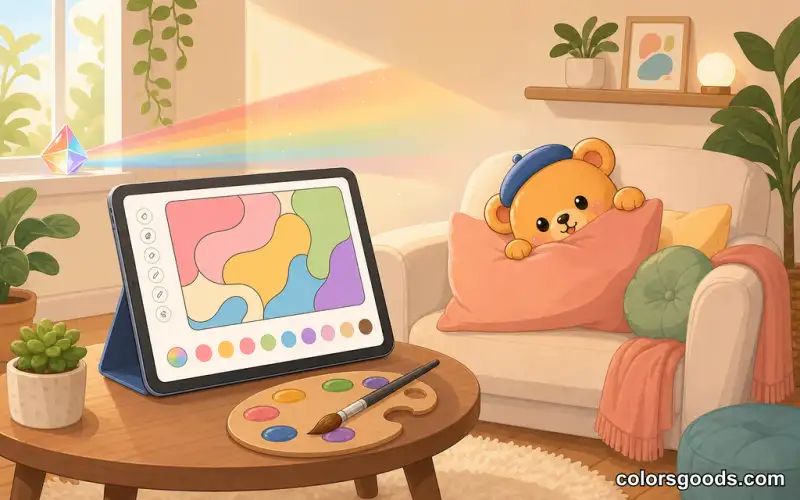
Step 3: Intermediate Techniques for Depth and Light
Gradient blending
Create a smooth transition from light to dark across one area — especially effective for skies, water, and walls. Start with your lightest shade where the light hits, add the medium tone in the middle, press hardest with the darkest shade toward the shadow side, then smooth the transition with light strokes.
Light source awareness
Every Bobbie Goods scene has an implied light source: a window, the sun, a lamp, a laptop screen. Identify it first, then apply one rule: surfaces facing the light are lighter, surfaces facing away are darker, and shadows fall in the same direction across the scene. Highlights appear on the top edges of rounded objects — a bear's head, a cupcake top, flower petals.
Three-tone depth
Pick three shades of one color family. Use the lightest on surfaces facing the light, the medium on flat mid-tones, and the darkest in shadow areas and under overlapping objects. Round heads, puffy cheeks, and curved bodies make Bobbie Goods characters natural three-tone shading practice.
Basic texture
Different surfaces ask for different strokes: soft directional strokes for fabric, small circular motions for icing, short varied strokes for leaves, long flowing strokes for fur.
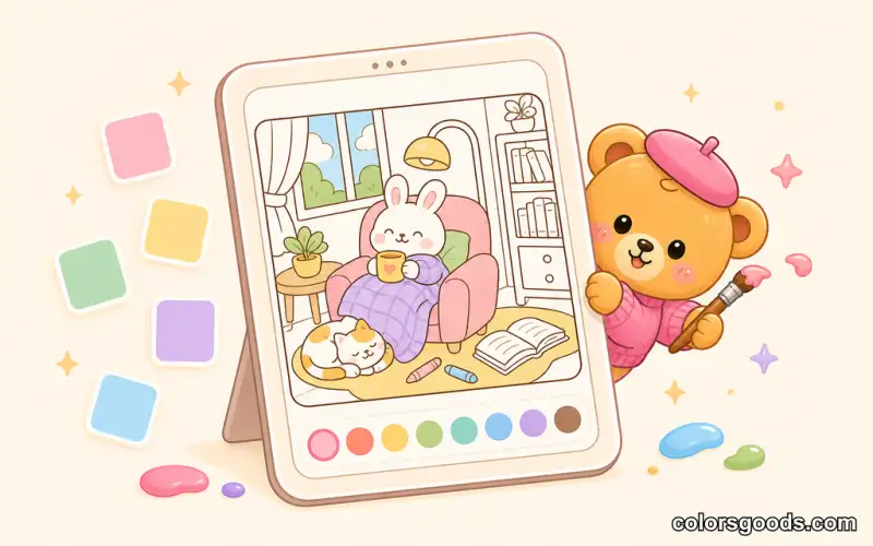
Step 4: Advanced Touches for a Professional Finish
Realistic fabric folds
Bobbie Goods characters often wear simple clothing — aprons, dresses, hats. Find where fabric would naturally fold (under arms, at the waist, around buttons), apply the darkest shade in the deepest part of each fold, use the medium tone on the slopes, and leave the highest points lighter for a highlight.
Skin tones, food gloss, and glow
For visible faces and paws, start with a warm beige or peach base, add pink to cheeks and knuckles, use a darker tone under the chin, and finish with a tiny highlight on the nose. Food scenes come alive the same way: a small white highlight for icing, a glossy upper curve for fruit, deep brown with one bright highlight for chocolate. And on dark pages, work from light to dark, layer navy and indigo instead of one flat dark, and let a single lamp or campfire become the focal point — a technique the Boo Goods night-cozy style puts to beautiful use.
Common Mistakes and How to Fix Them
- Pressing too hard flattens color and ruins blending. Use a light touch — you can always add another layer, but you cannot remove color.
- Jumping in without a plan leads to clashing colors. Choose your colors and assign them before you start.
- Ignoring the light source creates flat, confusing shading. Decide where the light comes from and shade everything consistently.
- Overworking an area makes it dull and waxy. Limit yourself to three or four layers, and change the color rather than keep layering if it is not right.
- Using too many colors creates visual chaos. Stick to a harmonious three-to-six palette and create variety through technique — light versus dark, smooth versus textured — rather than more hues.
FAQ
Do I need expensive tools to color Bobbie Goods pages?
No. On ColorsGoods, your phone and the built-in palette are enough. On paper, a basic set of colored pencils or markers works fine — the techniques here are tool-independent.
How do I blend without streaks?
Use light, overlapping strokes rather than straight lines and build color gradually. Keep highlights clean by leaving small areas lighter. On a touchscreen, work in short strokes and let the app's smooth fill help.
How do I color skin naturally on Bobbie Goods characters?
Start with a warm beige or peach base, add pink to cheeks and knuckles, use a slightly darker tone under the chin and around paws, and finish with a small highlight on the nose.
Can I mix markers and pencils on the same page?
Yes. Many colorists use markers for the base layer and pencils on top for details, shading, and texture. If you print pages at home, use heavier paper (160 gsm or more) so markers do not bleed through.
What is the best page to practice advanced techniques on?
Any page with several surface types is ideal — the art studio scene in the Spring Summer collection is a favorite because it combines fabric, food, skin, and background in one composition. For the foundational moves, see our beginner coloring techniques article.
How long does a Bobbie Goods page take?
A simple flat-color page takes twenty to thirty minutes; a page with gradients and shading can take one to two hours. Do not rush — the meditative quality of coloring is part of the benefit.
Put the Techniques to Work
You now have a complete toolbox: a working order, flat coloring, blending, shading, textures, and reliable palettes. The next step is practice. Pick one page, apply the order of work, and focus on a single technique — not all of them at once.
Start with the complete guide to coloring Bobbie Goods online if you need scene recommendations, then explore cozy indoor scenes for warm lighting practice, or our mental health and mindfulness guide if you want to turn practice into a daily ritual. And if you enjoy the cute-and-cozy universe, the Girl Moments collection offers the same warm feeling with different characters.
Every page you finish teaches you something. The simple charm of Bobbie Goods makes every result worth celebrating — so open a page, choose five colors, and enjoy the process.
Learn more about the project →
Colors Goods is researched, written, and reviewed by our small editorial team so every post stays clear, practical, and family-friendly.
Reviewed by Daniel Costa
Editorial contributor — app features and digital tools